HotSpot Parking, Redesigning Edmonton's Parking Registration Flow
.svg)
Product Designer
.svg)
Self-initiated, AI-assisted prototyping (Figma Make)
.svg)
1 Week
.svg)
Mobile Web
.svg)
Usability tested
DESCRIPTION
Edmonton's HotSpot Parking uses a browser-based registration flow for metered zones. Users scan a QR code at the meter and pay through their phone. I tested the current flow with 5 users, identified 6 friction points, used Figma Make to generate a redesign from structured research inputs, then validated the new flow with the same 5 users.
View Redesign PrototypeCONSTRAINTS
- Mobile browser flow (not native app)
- QR code scan is the entry point
- Zone number must be the dominant element
- No account creation required
- One-handed phone use
DELIVERABLES
- Usability-tested baseline: 5-user benchmark of current flow
- AI-generated interactive prototype: Live, tappable redesign via Figma Make
- Annotated iteration: Human-identified friction points for next version
Problem Framing
CONTEXT

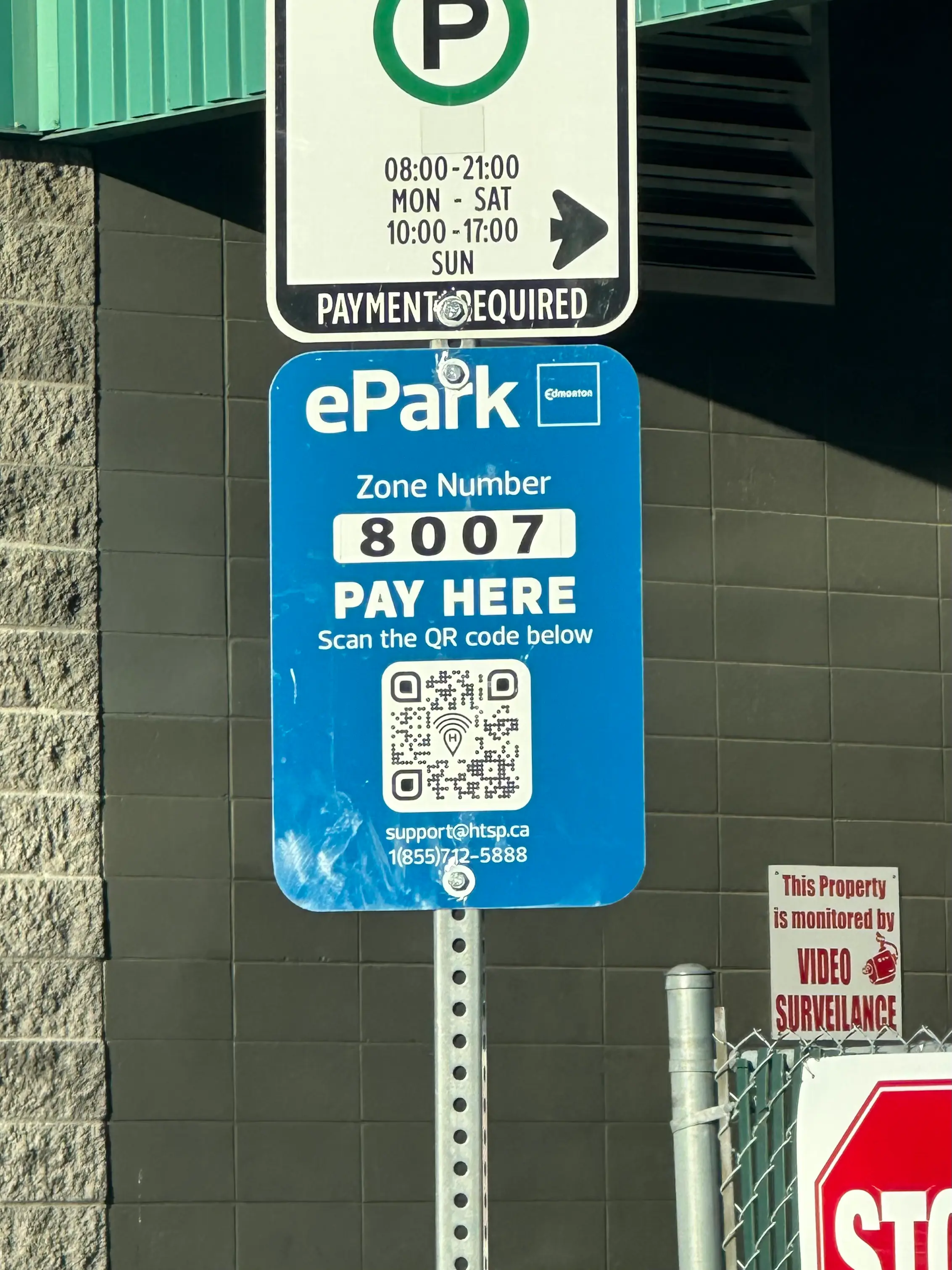
Edmonton uses HotSpot Parking for downtown metered zones. When a driver arrives, they scan a QR code on the parking meter, which opens a browser-based registration flow. No app download. No account. Just scan and pay.
Problem

First-time users averaged 1 minute and 33 seconds to complete parking registration.
The flow had 6 friction points: 1) a zone selector with no context, 2) a discount code field that confused users into entering their card number, 3) a plate number field that forced users back to their car, 4) a time-of-stay dropdown requiring mental math, 5) dense rate information, and 6) a confirmation description that took too long to read.
The flow had 6 friction points: 1) a zone selector with no context, 2) a discount code field that confused users into entering their card number, 3) a plate number field that forced users back to their car, 4) a time-of-stay dropdown requiring mental math, 5) dense rate information, and 6) a confirmation description that took too long to read.
Design Challenge

Reduce registration completion to under 30 seconds. Each step should have one clear action. The user should never wonder what to do next.
BASELINE TESTING
How I tested
I tested the live browser version of HotSpot Parking with 5 users. Each person scanned a QR code at a real downtown Edmonton meter and completed the full registration flow on their phone. I timed each session from the moment the browser loaded to successful payment confirmation.
Results
Average completion time: 1 minute 33 seconds
Individual times: 1:12, 1:29, 1:33, 1:37, 1:54
Individual times: 1:12, 1:29, 1:33, 1:37, 1:54


Friction points identified
"Nothing selected" zone field
No context provided. Long scrollable list of zone numbers. Weak searchability signifier.
Discount code field placement
Most users don't have a discount code, but the field appears right after time of stay. It added cognitive load and multiple users entered their card number here instead.
Plate number field
If the user doesn't know their plate, they leave the flow to check their car, adding time and breaking momentum.
Time of stay dropdown
Scroll-based dropdown. If users know when they're leaving (not how long they're staying), they have to calculate duration manually.
Rate information density
Descriptive text format requires reading. Could be more scannable.
Plate number confirmation description
"Double check that your plate number is correct" takes time to read. Adds friction at the final step.
THE AI-ASSISTED APPROACH
I used Figma Make to generate a redesigned flow. Instead of starting from a blank canvas, I structured the AI input the same way I'd structure a design brief for a human collaborator: a clear goal, the user context, technical constraints, baseline test data, and the specific friction points I wanted solved.
The Prompt (Used Claude Opus 4.6 model)
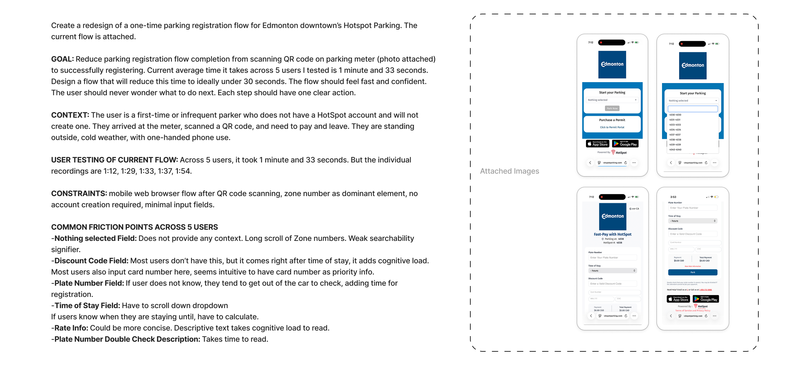
WHY THIS APPROACH
The goal was speed with structure. I had 7 documented friction points with real user data behind them. Feeding that into Figma Make as a structured brief meant the AI had the same information a designer would need to make good decisions. The output wasn't a guess. It was a response to specific, tested problems.
This is also the workflow I wanted to demonstrate: AI as a prototyping tool inside a research-driven process, not as a replacement for it.
The Redesign
Redesign Flow v1
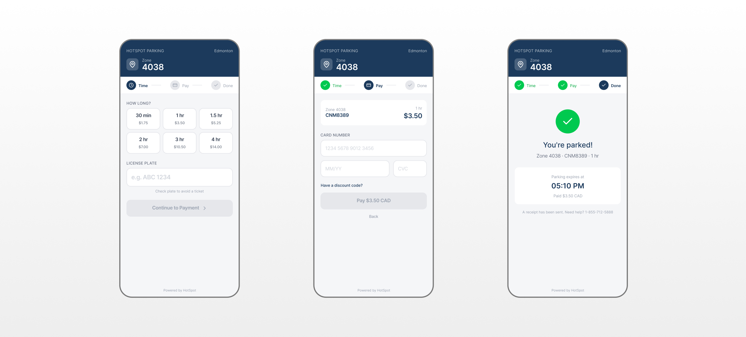
WHAT CHANGED
The original flow was a single long page with multiple inputs, confusing field ordering, and no progress indication. The redesign splits registration into a 3-step flow: Time → Pay → Done.
KEY DESIGN IMPROVEMENTS
Removed zone selection friction. Zone is pre-filled from the QR code and displayed prominently in the header. No scrolling through a list.
Replaced dropdown with tap targets. Time selection cards show duration and cost together. One tap instead of scroll, read, calculate.
Moved discount code off the critical path. Collapsed behind a link. Users who need it can find it. Users who don't aren't confused by it.
Added a progress stepper. Three steps (Time, Pay, Done) with visual state indicators. The user always knows where they are.
Surfaced price at every decision point. Cost is visible on the time cards and on the pay button. No surprises.
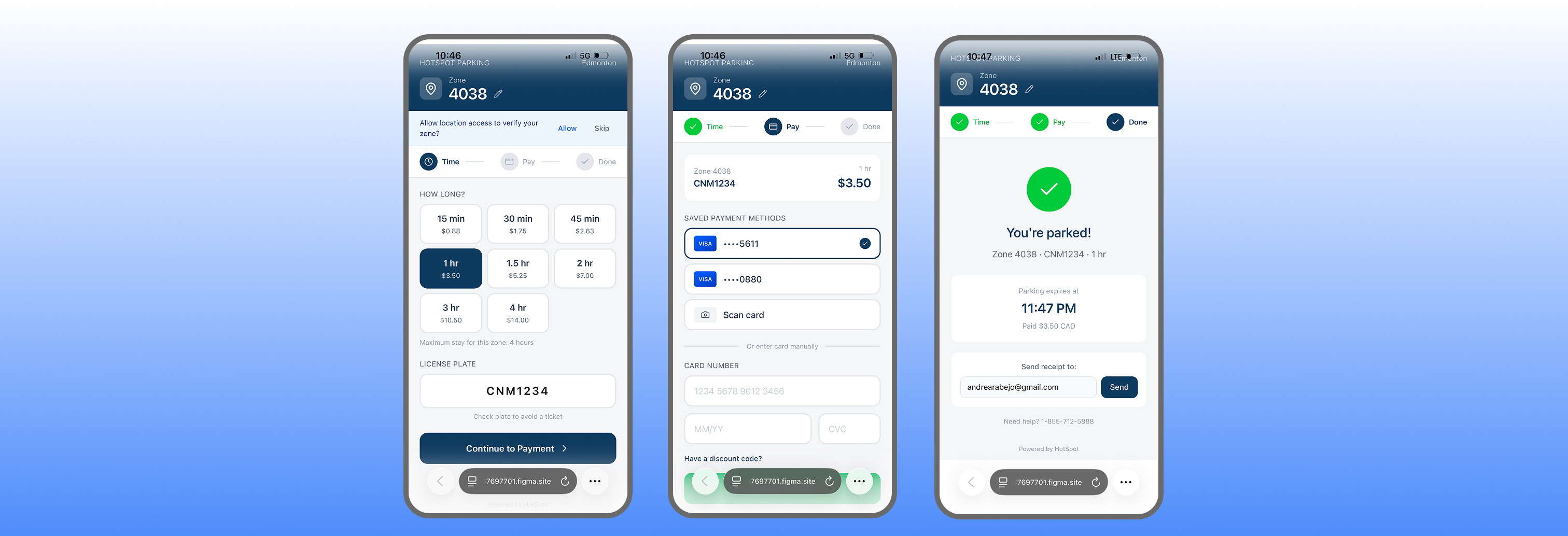
Step 1: Time - Zone number is locked in the header (auto-detected from QR code). Time selection uses tap-based cards showing duration and price together. No dropdown. No mental math. The user taps "1 hr / $3.50" and moves on. License plate input sits below with a clear placeholder format.
Step 2: Pay - A summary card confirms zone, plate, duration, and total before payment. Card fields are standard (number, expiry, CVC). Discount code is tucked behind a "Have a discount code?" toggle instead of sitting in the main flow. The CTA shows the exact amount: "Pay $3.50 CAD."
Step 3: Done - Confirmation screen shows zone, plate, duration, expiry time, and amount paid. Clear. Done. Walk away.
REDESIGN TESTING
How I tested
Same 5 users. Same setup: scan QR code, complete registration. Each person was given a prop card with fake payment details in their pocket to simulate real-world conditions (fumbling for a card while holding a phone).
I timed from the moment they began selecting time to successful payment confirmation.
I timed from the moment they began selecting time to successful payment confirmation.
Results
Individual times: 41s, 46s, 49s, 52s, 57s
That's a 47% reduction in task completion time.
That's a 47% reduction in task completion time.

Honest Caveats
These results are real but come with context I want to be transparent about:
Internet and signal speed
Varied between sessions and could affect load times.
Card verification time
Depends on the payment processor, not the design.
No input error simulation
The Figma Make prototype accepts any input as valid, so it doesn't account for typos or incorrect entries slowing users down.
System errors
Like misidentified zone numbers from QR scans aren't testable in a prototype.
The 47% improvement reflects the structural and interaction design changes. In production, real-world factors would affect absolute times, but the relative improvement in flow clarity and reduced friction points would hold.
What AI missed
Annotated Human Judgements
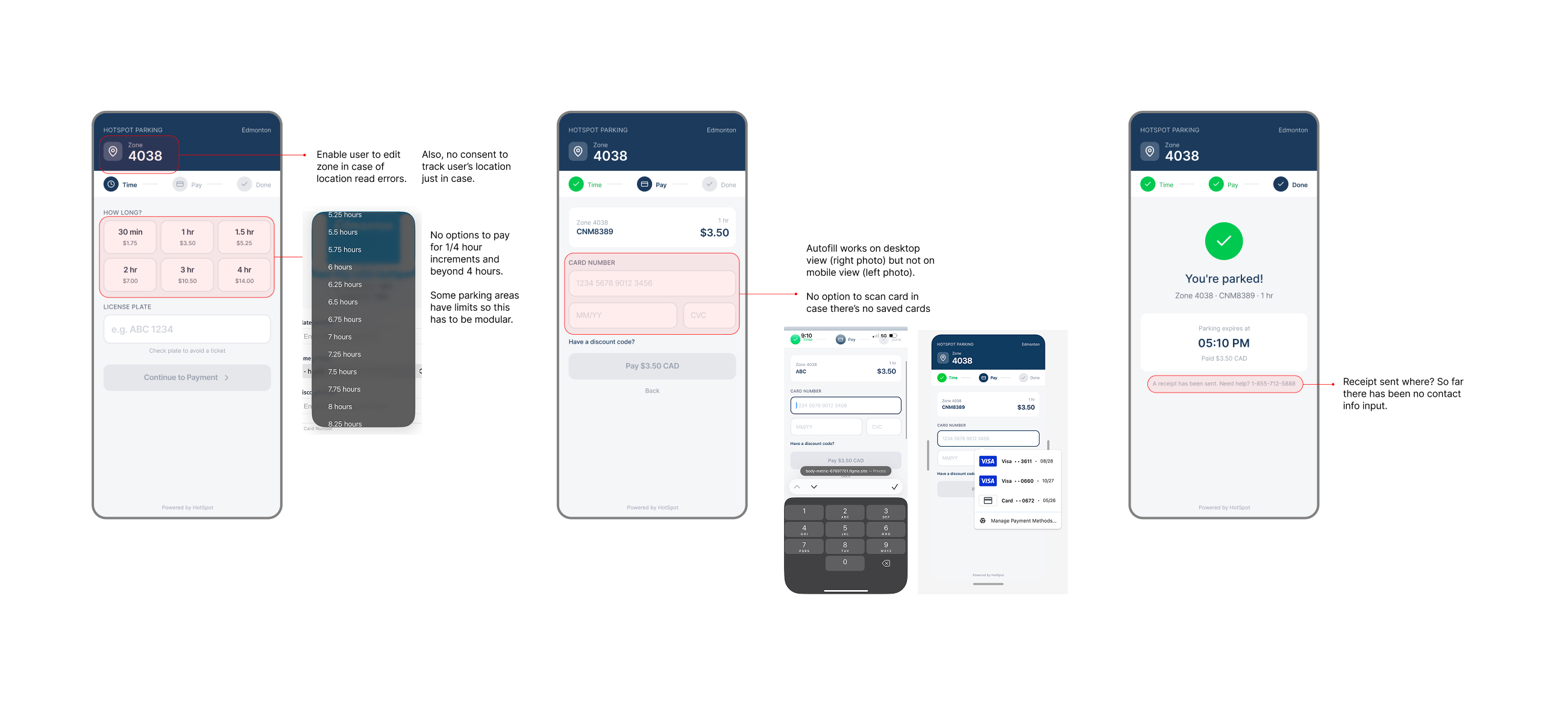
Testing the redesign with the same 5 users surfaced issues the AI-generated flow didn't anticipate. These are the friction points I identified through observation and documented as changes for the next iteration.
The AI handled the structural redesign well: it correctly identified that a multi-step flow with tap targets and visible pricing would outperform a single-page form with dropdowns. But it couldn't anticipate edge cases (zone misreads), platform inconsistencies (mobile autofill), or logical contradictions (receipts without contact info).
This is the value of human review in an AI-assisted workflow. The AI gets you to a testable prototype fast. The human catches what the AI can't see.

Zone should be editable. The AI locked the zone number as a static display. But QR codes can misread, and some parking areas have multiple zones. Users need a way to correct the zone without restarting the flow.
Time increments are too limited. The redesign offers 30 min, 1 hr, 1.5 hr, 2 hr, 3 hr, and 4 hr options. There's no quarter-hour flexibility, and some parking zones have maximum time limits. This needs to be modular per zone.
No mobile autofill or saved card support. Autofill works on desktop but not in the mobile browser prototype. There's also no option to scan a card with the camera or select from saved payment methods. For a flow designed around speed, manual card entry is the biggest remaining bottleneck.
"Receipt sent" with no contact info collected. The confirmation screen says "A receipt has been sent," but at no point in the flow does the user provide an email or phone number. This is a logical contradiction the AI didn't catch.
Redesign Flow v2
The redesigned flow with all usability fixes applied:
1) editable zone field with location verification fallback,
2) 15-minute time increments with zone-specific max stay limits,
3) saved payment methods with card scan option, and
4) receipt delivery that actually collects contact info before confirming.
1) editable zone field with location verification fallback,
2) 15-minute time increments with zone-specific max stay limits,
3) saved payment methods with card scan option, and
4) receipt delivery that actually collects contact info before confirming.
The outcome
47% faster registration

1:33 to 49 seconds
Average completion time dropped from 1:33 to 49 seconds across 5 users. The structural changes (stepper, tap-based selection, simplified payment) drove the improvement.
Live interactive prototype
Redesign is available as a tappable web prototype via Figma Make. Users and reviewers can experience the full flow on mobile.
AI + human validation loop
AI generated a functional redesign from structured research inputs. Human testing validated the improvement and caught 4 interaction-level issues the AI missed. Both steps were necessary.
Next steps
If I continued this project...
.svg)
Test with a larger sample: 5 users was enough to identify patterns and measure improvement, but a larger group would strengthen confidence in the 47% figure.
Add error state testing: Simulate typos, incorrect card numbers, and failed payments to measure how the redesign handles mistakes.
Explore native integration: The browser flow has inherent limitations (no saved cards, no push notifications for expiry). A native wrapper or progressive web app could address the biggest remaining friction points.