KnowQuest — Verification-first Review Platform (Native Mobile Redesign)
DESCRIPTION
Native mobile experience that replaces opinion-based reviews with verified, criteria-based feedback so users can trust what they see and businesses can act on signals.
CONSTRAINTS
- Solo designer, stakeholder alignment handled directly with CEO
- Academic timeline + real-world validation goals
- No backend changes; UI had to communicate verification + trust without new systems
DELIVERABLES
- End-to-end mobile redesign: onboarding → discover → rate → redeem → dashboards
- Trust + verification UX system: criteria rating, verification gates, badges, micro-feedback
- Developer-ready artifacts: annotated flows, interaction specs, UI system
Problem Framing
CONTEXT

KnowQuest is a verification-first review platform designed to help businesses collect reliable customer feedback while rewarding users for submitting verified reviews through a gamified system.
Problem

Despite the concept, the platform struggled to build credibility.
The interface had usability issues, the platform contained sparse review content, and its visual presentation created associations with low-trust or scam-like review sites.
The interface had usability issues, the platform contained sparse review content, and its visual presentation created associations with low-trust or scam-like review sites.
Design Challenge

Redesign the platform to establish trust, improve usability, and make the review and reward system clear so users feel confident contributing reviews and businesses can extract meaningful insights.
challenges
Sparse inherited product
Existing web UI provided minimal insight into system logic, flows, or feature intent, requiring product direction to be inferred from incomplete artifacts.
Core flows were designed without full backend clarity, requiring assumptions that balanced usability, feasibility, and risk.
Core flows were designed without full backend clarity, requiring assumptions that balanced usability, feasibility, and risk.


Trust vs gamification tension
Gamification was core to retention but risked feeling gimmicky unless carefully structured around verification and credibility.
Unclear product vision
Value proposition and trust model were not clearly articulated, forcing design decisions to anticipate scale without certainty.

Web → native translation
Incomplete system constraints: Core flows were designed without full backend clarity, requiring assumptions that balanced usability, feasibility, and risk.
decision environment
Two distinct audiences (consumers vs. businesses) with opposing mental models
A mobile-first experience that needed to feel legitimate, not just gamified
No backend changes, credibility had to be communicated purely through interface and flow
Research insights that conflicted with common UX patterns (e.g., minimal UI reduced trust)
research insights
Research findings eliminated several design directions early and forced clear priorities:

Trust needed to be visible at a glance; explanations alone were insufficient

Sparse or overly minimal UI reduced perceived legitimacy

Users required continuous system feedback to feel confident completing actions

Gamification increased engagement only when restrained and credibility-focused

Structured, criteria-based input was trusted more than open-ended reviews
Key decisions
Prioritized verification signals over social proof
Why
Research showed users equated professionalism with process, not popularity. Anonymous ratings and aggregate scores without proof reduced trust rather than increasing it.
What I delivered
1) Verified badges tied to transaction proof,
2) Clear system status indicators during review submission,
3) Contextual tooltips explaining verification without overwhelming the UI
2) Clear system status indicators during review submission,
3) Contextual tooltips explaining verification without overwhelming the UI
Trade-off accepted
Reduced emphasis on social engagement signals in favor of higher UI density and explicit verification indicators.

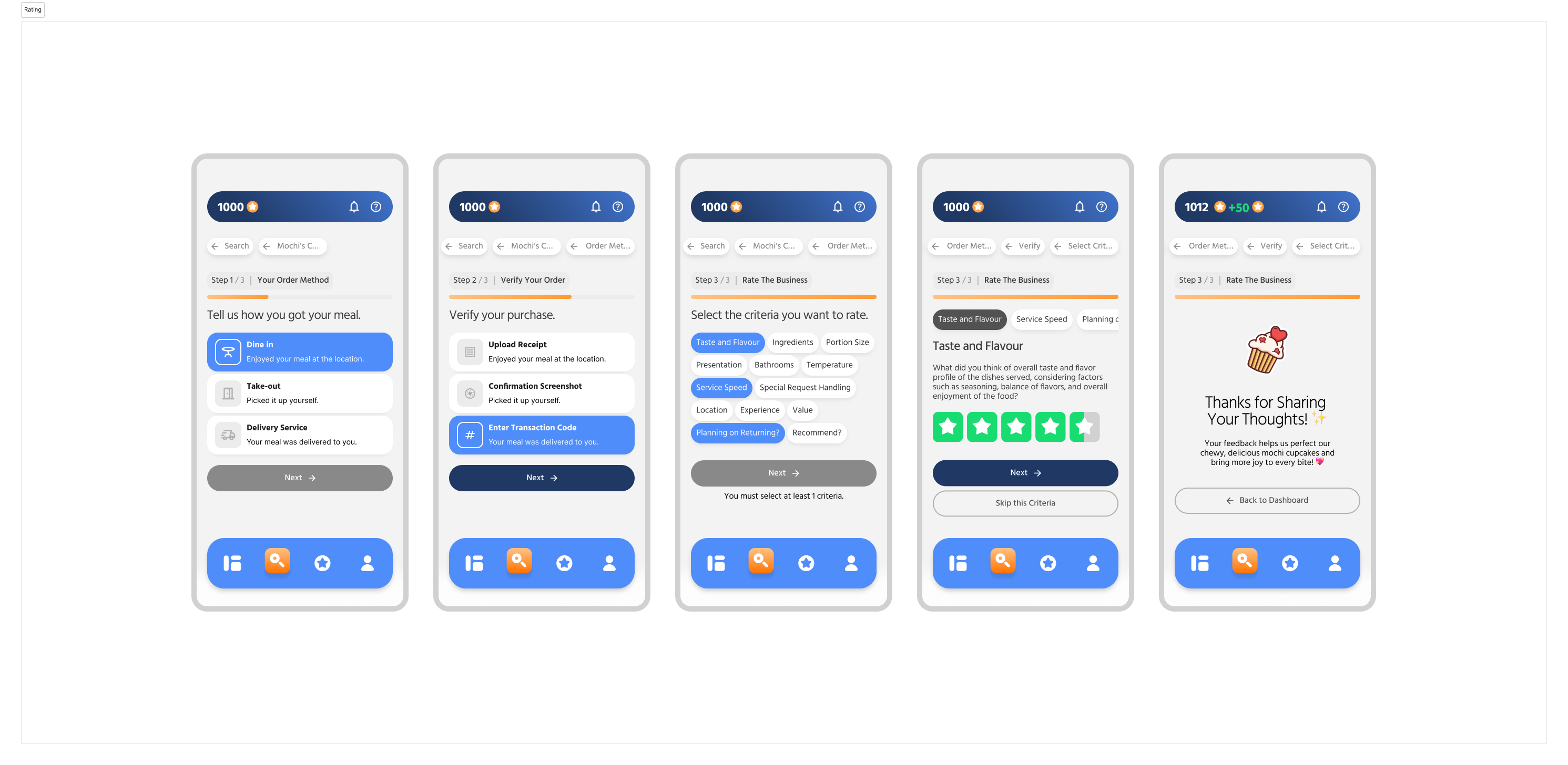
Structured rating flow instead of free-form reviews
Why
Open-ended reviews produced vague, biased, and low-confidence feedback. Users trusted structured criteria more than subjective commentary.
What I delivered
1) Criteria selection before rating
2) One-criterion-at-a-time star ratings
3) Short prompts to anchor user intent
2) One-criterion-at-a-time star ratings
3) Short prompts to anchor user intent
Trade-off accepted
Reduced expressive nuance across individual reviews in exchange for standardized signals that could be aggregated, compared, and acted on with confidence.
Step-based wizard pattern to manage cognitive load
Why
Critical flows became overwhelming when multiple decisions were presented simultaneously. Users lost momentum when forced to reason about system state, intent, and consequences at the same time.
What I delivered
A reusable step-based wizard pattern applied consistently across: Account onboarding & Business rating flows
Trade-off accepted
Longer completion time for experienced users in exchange for reduced abandonment, clearer mental models, and higher accuracy across first-time and returning users.

Intentional friction at point redemption
Why
Reward redemption represents irreversible loss. Users needed confidence, not speed, at this moment.
What I delivered
1) Front-loaded reward clarity (cost, expiry, availability)
2) Confirmation step with repeated key details
3) Distinct loading and success states
2) Confirmation step with repeated key details
3) Distinct loading and success states
Trade-off accepted
Slightly slower flow to prevent accidental spending and anxiety.
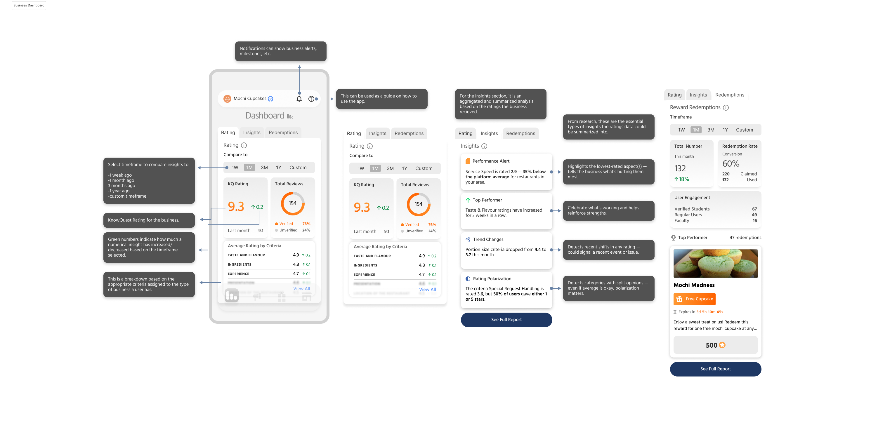
Business dashboards focused on insights
Why
Business users had limited time and did not benefit from exhaustive analytics.
What I delivered
1) Synthesized alerts and trends
2) Outlier surfacing (lowest-rated criteria, sudden drops)
3) Clear signals indicating where and why to act
2) Outlier surfacing (lowest-rated criteria, sudden drops)
3) Clear signals indicating where and why to act
Trade-off accepted
Reduced data exposure in favor of decision-ready summaries.

build-ready artifacts
Verification Status

Redemption Confirmation
.png)
Rating criteria structure

Business Dashboard

Consumer vs Business Navigation

The outcome
Validated through usability testing

9/10
Participants completed the core review flow without assistance.
10-person usability test — 9/10 completed the core review flow.
Friction points: point system confused onboarding clarity; Rate entry point wasn't visible from the dashboard.
Friction points: point system confused onboarding clarity; Rate entry point wasn't visible from the dashboard.
End-to-end prototype delivered

Shipped a complete interactive native mobile prototype (Consumer + Business) covering the core loop: onboarding → search → rate/verify → points → redeem, plus business insights and role-based navigation.
Product direction validated by leadership

Following the handoff, the CEO confirmed the work had been passed to the DevOps team for implementation planning, indicating internal confidence in the product direction.

Next steps
Several areas were intentionally deferred to preserve clarity and focus at this stage:
.svg)
Verification at scale: The trust model has not yet been validated under real production volume. Future iterations would test how verification signals perform as usage, edge cases, and abuse patterns increase.
.svg)
Gamification vs credibility balance: Incentives were designed conservatively to avoid gimmicks, but long-term engagement would require monitoring how rewards influence behavior without undermining trust.
.svg)
Business insight validation: Dashboard insights were designed for clarity and action, but their effectiveness ultimately depends on real usage patterns and decision outcomes from business operators.
.svg)
Deferred business tooling: Features such as campaign management and reward offer configuration for businesses were intentionally not explored. These were considered nice-to-have at this stage, secondary to validating the consumer-side experience and core trust mechanics.
.svg)
.svg)
.svg)
.svg)
.svg)
