SPIN2, IA + In-Flow Guidance for Jargon-Heavy Land Title Search
.svg)
Information Architecture & UI Designer
.svg)
4 UX Designers
.svg)
12 weeks
.svg)
Web
.svg)
Academic Project (IA/UX Redesign)
DESCRIPTION
Made a complex, terminology-constrained government search system feel navigable for beginners without dumbing it down.
CONSTRAINTS
- Legal land-title terminology could not be removed or reworded
- The system must remain precise and “official”
- Clarity needed to be additive (guidance), not reductive (oversimplifying labels)
DELIVERABLES
- Revised information architecture + navigation structure (sitemap / page hierarchy + primary entry points).hboards
- High-fidelity redesigned key pages (search landing + results/detail flows with in-flow guidance/tooltips).
- Interactive prototype / click-through walkthrough (core task flow demonstrating learnability improvements).
Problem Framing
CONTEXT

SPIN2 is a government land title search system used by legal professionals to access land records, generate documents such as DRRs, and perform property searches.
Problem

The system’s interface is difficult for first-time users to understand due to jargon-heavy terminology, complex workflows, and an outdated interface that requires prior system knowledge.
Design Challenge

Reorganize the information architecture and interface so new users can successfully navigate the system while preserving the efficiency and depth required by expert users.
My Role
.svg)
Designed low-fi → high-fi redesigned homepage
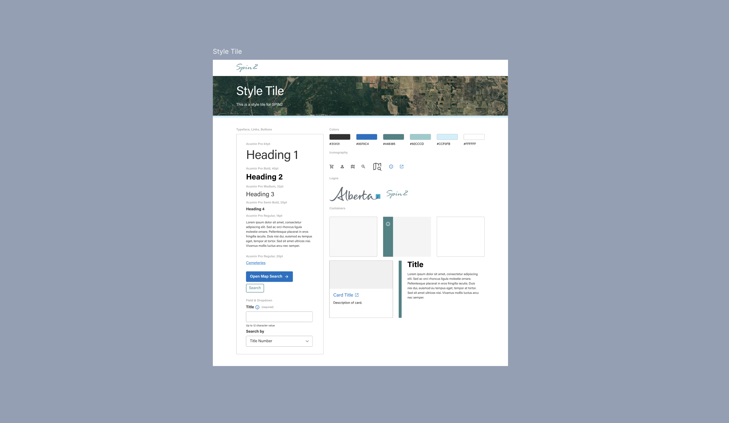
Built the team’s style tile (type, color, components direction)
Designed search modules + reusable table components for search categories
Designed hover + modal tooltip pattern and reusable components
Unified screens into one interactive prototype for review and handoff
challenges
Terminology trap
Legal land-title terms couldn’t be simplified, so clarity had to come from in-flow guidance and hierarchy rather than rewriting language.


“Too many ways to search” overload
Multiple search types felt like duplicates; users asked “what are we searching for?”
Help was detached from the task
Explanations live elsewhere, forcing context switching during searches for users as well as designers, since we weren't familiar of some search terms as well.


Learnability without slowing experts
New users need guidance, but experts need speed. One UI must serve both.
research insights
Research findings eliminated several design directions early and forced clear priorities:

Competitive scan: Borrowed proven navigation + search patterns from other land registry systems to reduce ambiguity and speed up “where do I start?”
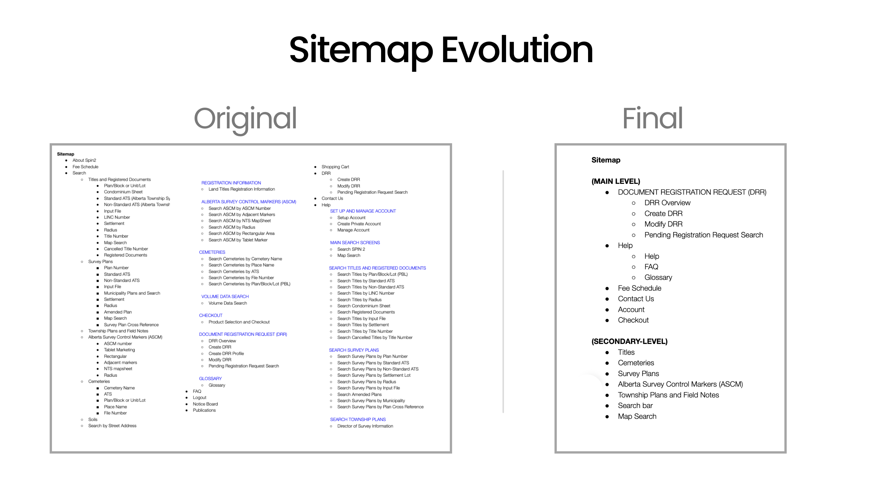
Sitemap audit: Flagged overloaded/duplicative “Search…” labels and gaps in grouping, then used that term list to drive testing.
Card sort (8 users): Exposed mental-model splits + key confusions (Account vs Private Account, LINC vs Title #) and “too many ways to search” frustration.
Tree test (8 users): Confirmed biggest failures were terminology + category ambiguity; “Create DRR” flowed best while Fee Schedule + Survey tasks caused multi-category hunting.
Key decisions
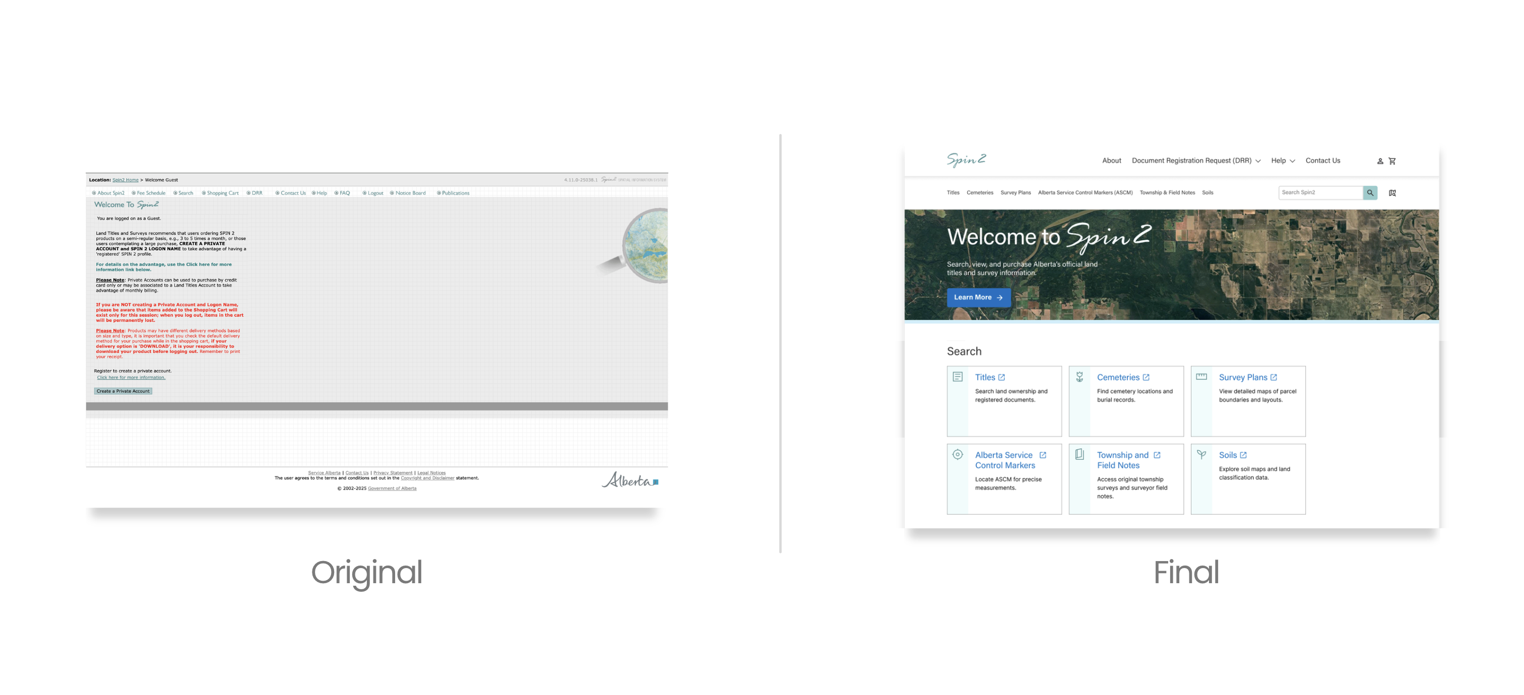
Homepage as a decision directory, not a landing page
Why
Users were guessing where to start; cards + hierarchy reduce search-start anxiety.
What I delivered
High-fi homepage with clear entry tiles/cards, consistent descriptions, obvious CTAs.
Trade-off accepted
Less room for announcements/marketing content; prioritizes task-start over storytelling.


Keep official terminology, add point-of-need decoding
Why
You can’t rename legal concepts; you can reduce cognitive load by explaining them at the moment of choice.
What I delivered
Reusable tooltip/modal pattern for terms like Plan, Block/Unit, Lot, Rights Type, etc.
Trade-off accepted
Adds interaction steps; some users won’t open help unless prompted.
Standardize search modules across categories
Why
Inconsistent layouts force relearning; consistency builds confidence in a complex system.
What I delivered
Reusable search module + table component patterns for categories (fields, dropdowns, results table behaviors).
Trade-off accepted
Less visual “custom fit” per category; commits to a system.


Use progressive disclosure for deep guidance
Why
Beginners need help, experts need speed; progressive disclosure serves both.
What I delivered
Accordions for “How to search” / “Fee info” and contextual help links and tooltips
Trade-off accepted
Hidden content can be missed; needs clear affordances.
artifacts
Research
Samples of best design patterns from the Competitive Analysis
LTSA

Quick access to core functionalities for returning users.
Alberta Registry for Land Online

A structured “select search type → show only the required fields” flow prevents bad inputs and lowers cognitive load by keeping the form minimal, guided, and error-resistant
Flow

Uses accordion for progressive disclosure
Saskatchewan Registry Services

A two-level nav cleanly separates “account/admin utilities” (login, contact, global search) from “task navigation” (category + subpages), so power actions stay one click away without polluting the user’s main wayfinding.
GeoWarehouse

Single source of authoritative property information so users can create, verify, and access property details.
Sitemap Audit + Key Terms

Card Testing Results

Tree test tasks and key findings

Style Tile: Alberta Government Branding Adjacent
Nav Bar: Before vs After

Homepage Above the Fold: Before vs After
Category Pages: Before (Separate Pages) vs After (Integrated Info + Search)

The outcome
First-click testing with 10 participants

8/10
Found a correct path to land title search.
7/10
Chose the card over the nav bar, validating card-first hierarchy as the more intuitive entry point.
Delivered a research-backed IA direction
Comparative patterns + card sort + tree testing converged into a clearer sitemap and navigation logic.
Raised learnability without renaming regulated terms
Designed in-flow guidance patterns that help first-time users decode SPIN2 terminology at the moment of choice, while maintaining workflow speed for expert users.

Next steps
Several areas were intentionally deferred to preserve clarity and focus at this stage:
1/10 who clicked Soils as evidence that card label clarity still warrants further testing.
Instrument search + help usage: measure keyword search usage, tooltip opens, and drop-offs to identify remaining confusion points.
Taxonomy/synonyms tuning: add common synonyms (Title vs LINC vs legal record) to improve findability.
Accessibility pass: keyboard navigation, focus states, contrast, tooltip/modal behavior with screen readers.