B.C. & Alberta Wildfire Activity Info
A comparative environmental data visualization of wildfire history in BC and Alberta from 2019 to 2023

Graphic Design

Information Design, Data Visualization
The Context
Wildfire data across British Columbia and Alberta is publicly available but fragmented across provincial reports.
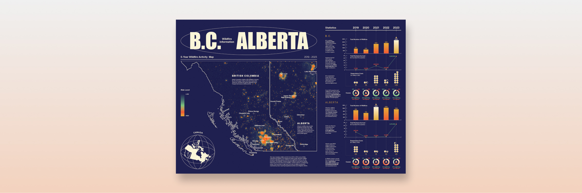
This project translates five years of wildfire data (2019–2023) into a structured visual framework that allows side-by-side provincial comparison while preserving geographic context.
This project translates five years of wildfire data (2019–2023) into a structured visual framework that allows side-by-side provincial comparison while preserving geographic context.

The Constraints

Must integrate spatial GIS data and statistical comparisons in one composition
Five-year span (2019–2023) required temporal consistency
High data density without visual overload
Side-by-side BC vs Alberta comparison
Maintain data credibility and proportional accuracy
The Approach
Structure first, then style
I structured the layout around a macro-to-micro hierarchy:
1) Large spatial anchor (5-year wildfire activity map)
2) Modular statistical system (right panel)
3) Consistent year alignment across all metrics
The left establishes geographic truth.
The right explains magnitude and cause.
This contrast between spatial density and grid precision creates visual rhythm while guiding interpretation.

Designing for comparison, not decoration
Instead of styling each chart independently, I built a repeatable comparison system:
1) Identical chart structure for both provinces
2) Shared scale logic. Unified color language
3) This reduces cognitive switching when comparing BC and Alberta.
Charts are flat and proportional: no 3D, no distortion, no novelty effects.
1) Identical chart structure for both provinces
2) Shared scale logic. Unified color language
3) This reduces cognitive switching when comparing BC and Alberta.
Charts are flat and proportional: no 3D, no distortion, no novelty effects.

The Exploration
Explored multiple layout directions to resolve one core tension: balancing a dominant spatial map with dense comparative statistics.
Iterations tested hierarchy, province segmentation, and data panel structure before committing to a macro-map + modular comparison system.
Iterations tested hierarchy, province segmentation, and data panel structure before committing to a macro-map + modular comparison system.


The Final Result
A structured, side-by-side wildfire visualization integrating five years of spatial activity with aligned statistical comparisons: balancing geographic context, magnitude, and cause data within a unified, modular system.
Final Poster
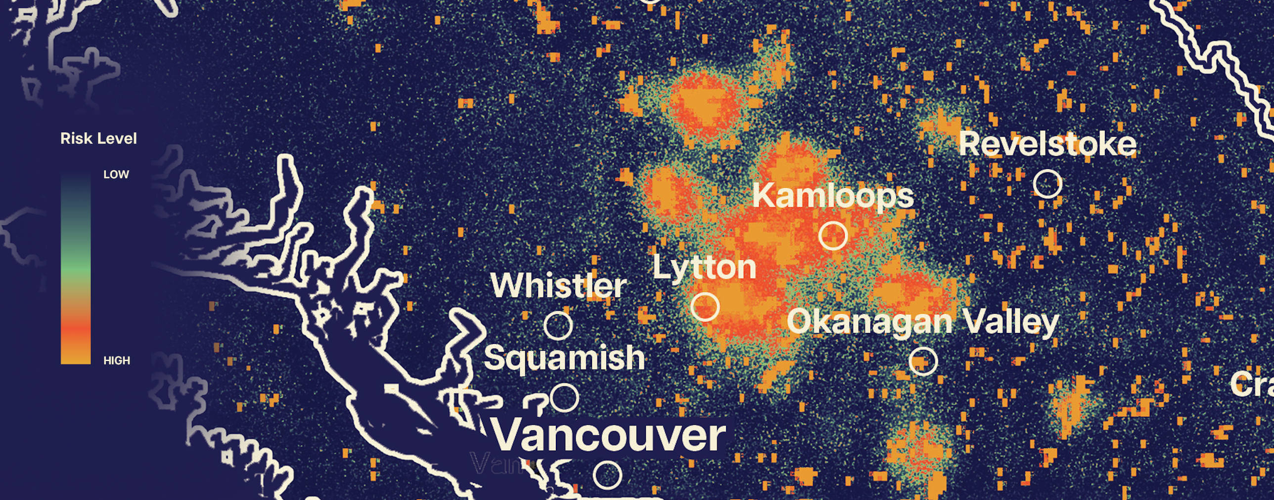
Wildfire History Map Close Up
Close-up of recurring wildfire hotspots, illustrating intensity clustering and regional concentration over five years.
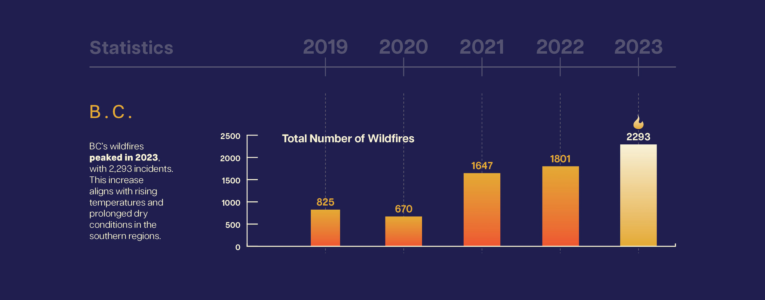
Total No. of Wildfires
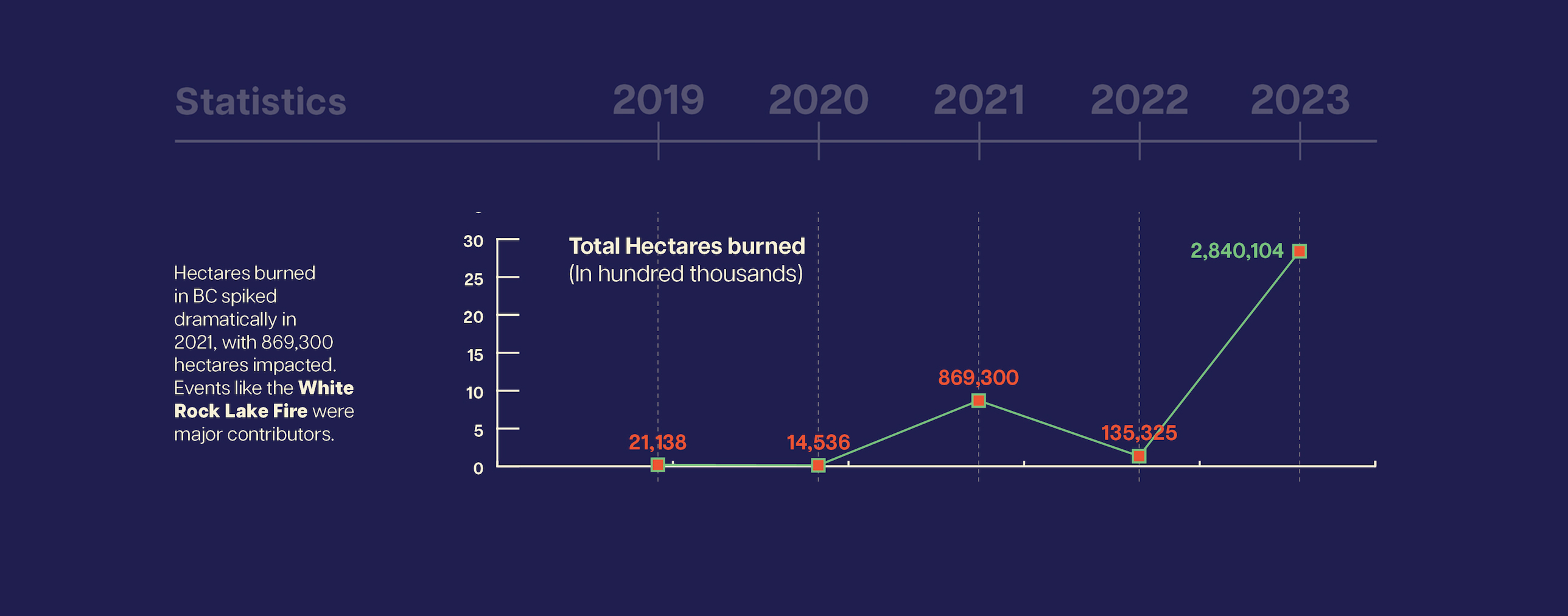
Hectares Burned
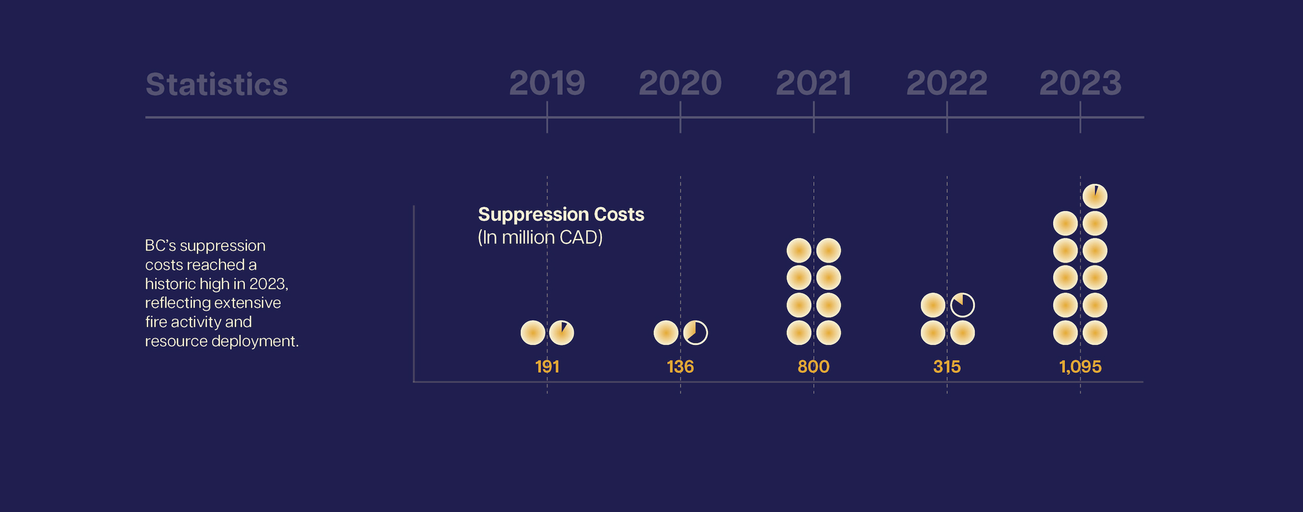
Suppression Cost
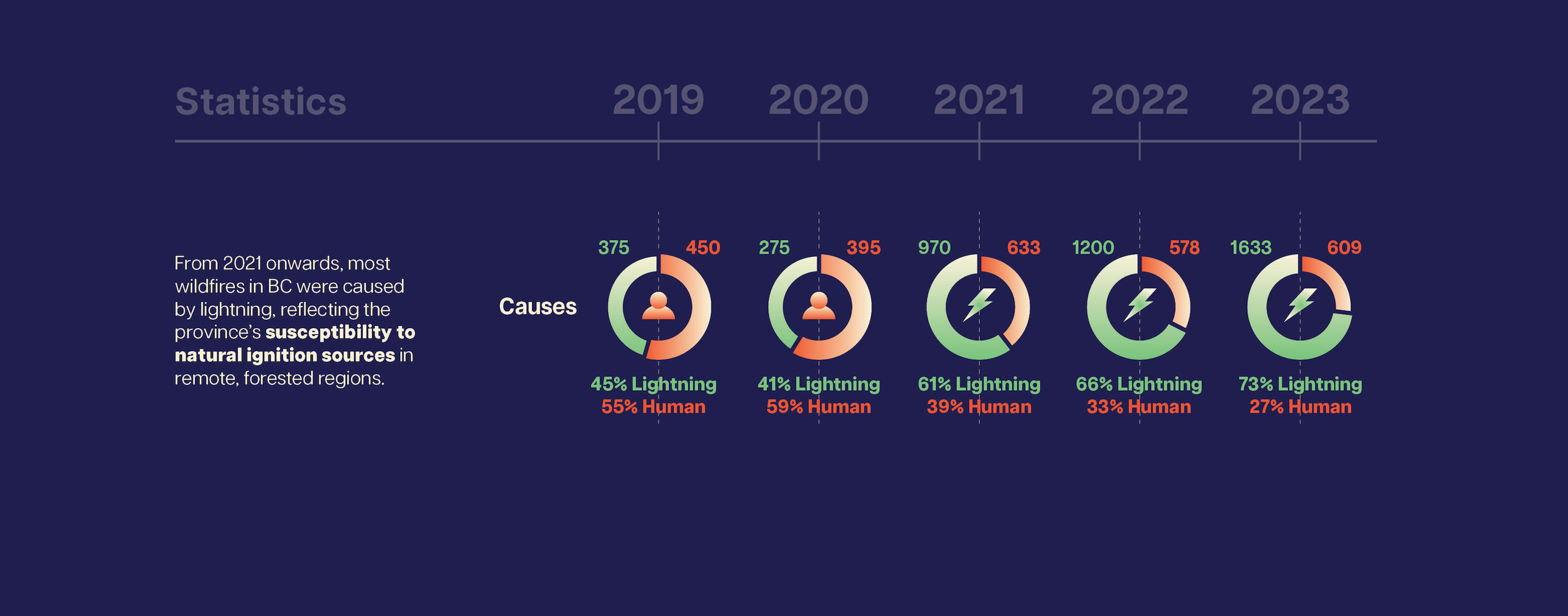
Causes
The Application
While designed as a large-format infographic, the system could translate into:

Multi-slide environmental reports
Interactive dashboards
Government communication materials