Taste of Edmonton Brand Identity
A full brand identity and campaign system concept for Edmonton's largest food festival — logo, brand guidelines, and event collateral designed to reflect culinary diversity and community spirit.

Brand Designer

Campaign System, Multi-format Collateral
The Context
Taste of Edmonton is Western Canada's largest food festival — eleven days of culinary sampling, performing arts, and community events held annually at Sir Winston Churchill Square. Since 1984, the festival has grown to represent Edmonton's cultural diversity, but its visual identity hadn't kept pace.
The existing branding lacked cohesion across formats. Promotional materials, signage, and digital presence felt disconnected, and the visual language didn't communicate the festival's core values: culinary exploration, community engagement, and inclusivity. The brief was to redesign the brand identity from the ground up and extend it across every touchpoint — from lanyards to landing pages.
The existing branding lacked cohesion across formats. Promotional materials, signage, and digital presence felt disconnected, and the visual language didn't communicate the festival's core values: culinary exploration, community engagement, and inclusivity. The brief was to redesign the brand identity from the ground up and extend it across every touchpoint — from lanyards to landing pages.

The Constraints

The identity had to feel festive and approachable while remaining professional enough for sponsor-facing materials and civic partnerships.
All assets needed to scale across formats — posters, lanyards, and tickets — without losing coherence.
The visual system had to differentiate from Heritage Festival, Edmonton's other major cultural event, which uses similar warm/bright palettes.
Brand elements had to function as standalone pattern assets, not just as a logo — the shapes needed to work independently across applications.
The Approach
Research first, aesthetics second
I started with a competitive analysis against Heritage Festival and an audit of food festival branding patterns nationally. Five research themes emerged: 1) community engagement, 2) sustainability, 3) accessibility, 4) volunteerism, and 5) artisan culture — and these became the conceptual anchors for every visual decision.
The moodboard centered on five adjectives: festive, lively, diverse, dynamic, and welcoming.
The moodboard centered on five adjectives: festive, lively, diverse, dynamic, and welcoming.

Shapes that work harder than a logo
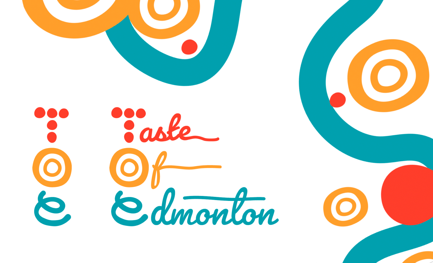
The core design decision was to build the identity around three abstract shapes derived from the logo letterforms — dots (T), concentric circles (O), and waves (E). Each shape carries meaning (togetherness, the plate/communal experience, and culinary flow) but more importantly, each can be extracted and used independently as pattern, texture, and color-coding across the entire system. This is what makes the identity scalable — the logo isn't the brand. The shape language is.
The Exploration
I explored over 30 logo directions, starting with pencil sketches and moving into Illustrator.
Different directions were refined and evaluated against three criteria: versatility across formats, differentiation from Heritage Festival, and whether the shapes could function as standalone brand elements.
Different directions were refined and evaluated against three criteria: versatility across formats, differentiation from Heritage Festival, and whether the shapes could function as standalone brand elements.


The Final Result
A vibrant, shape-driven identity built on red, orange, and teal with organic forms that reflect culinary culture without relying on literal food imagery. The abbreviated "TOE" logo and full "Taste of Edmonton" script variation give the system flexibility across formal and informal contexts.
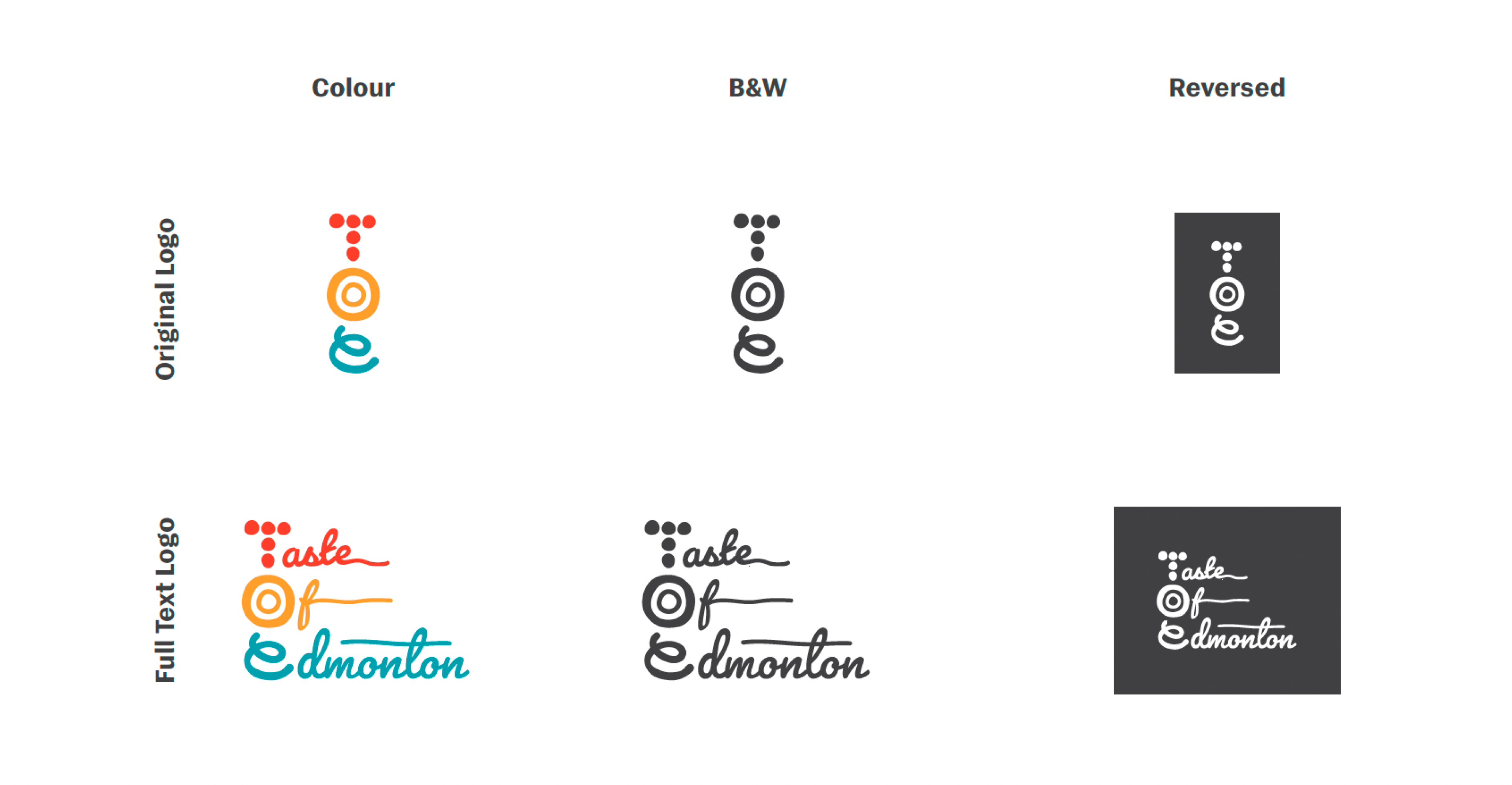
Logo Variations
Full logo system — abbreviated mark, full script variation, B&W and reversed versions for flexible application.
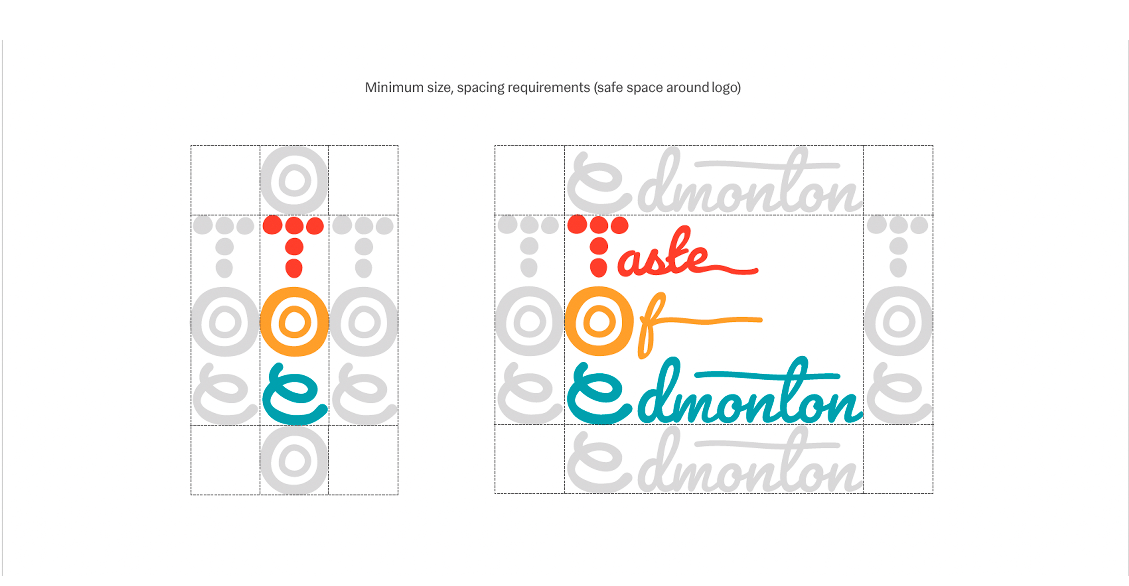
Logo Sizing and Spacing
Minimum sizing and clear-space rules ensuring legibility at all scales.
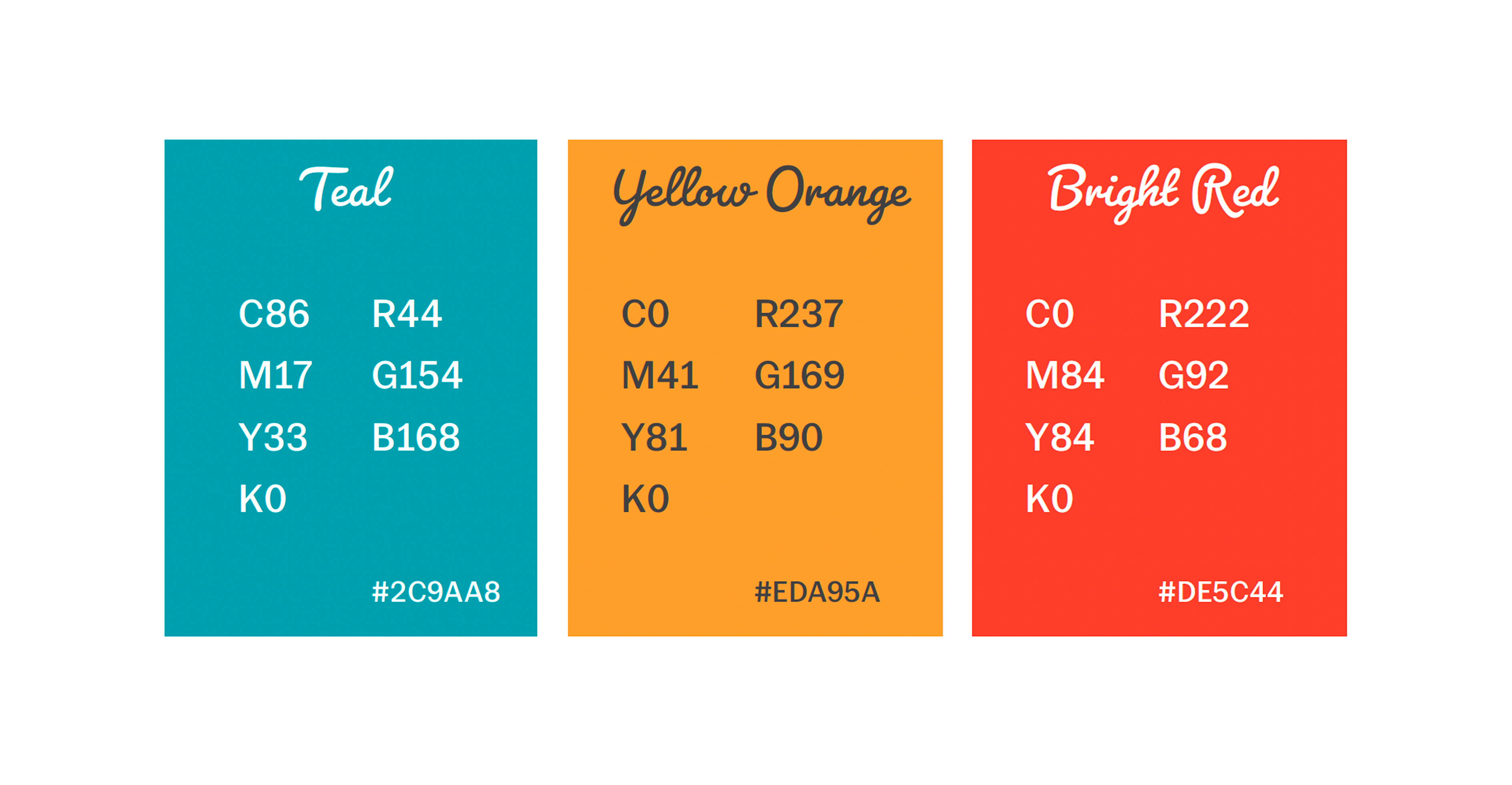
Color System
Color palette with functional role mapping — red (vendors/energy), orange (volunteers/warmth), teal (performers/freshness).
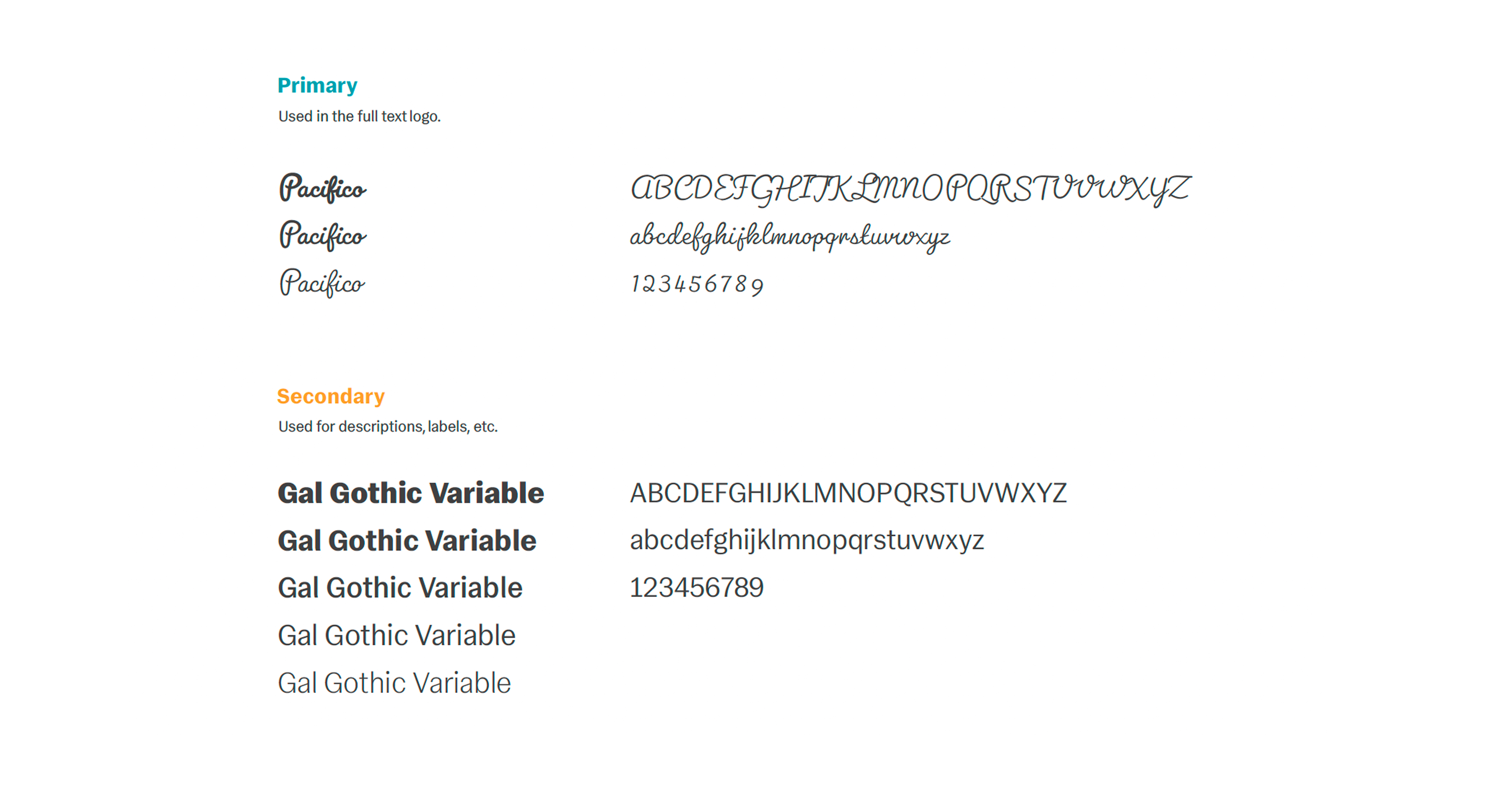
Typography Guidelines
Type system pairing Pacifico (display/logo) with Gal Gothic Variable (body/labels) for contrast between festive personality and functional clarity.
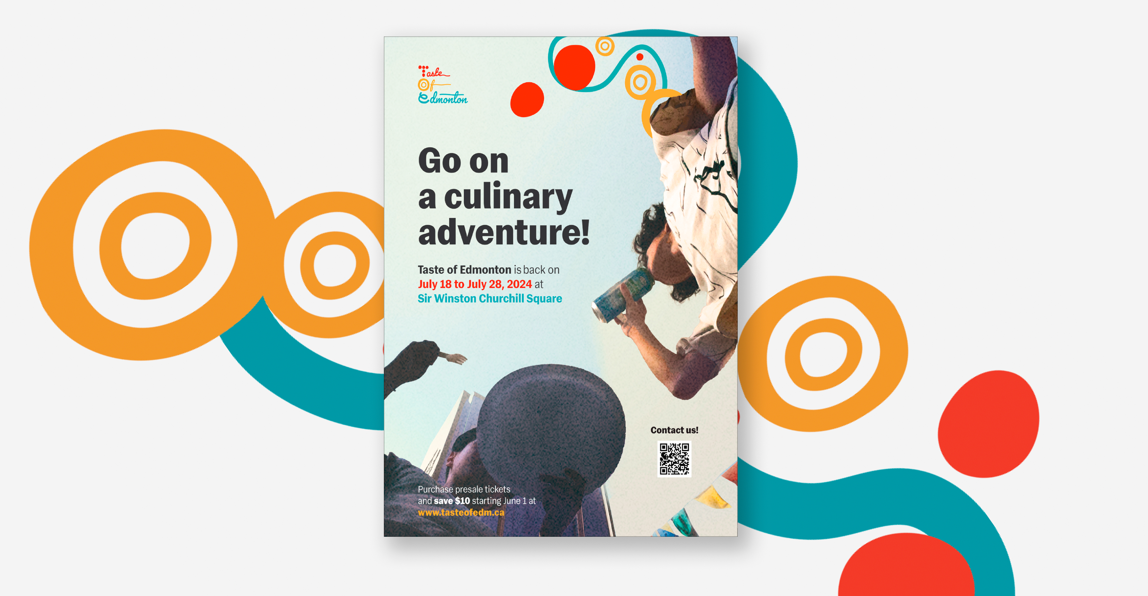
The Application
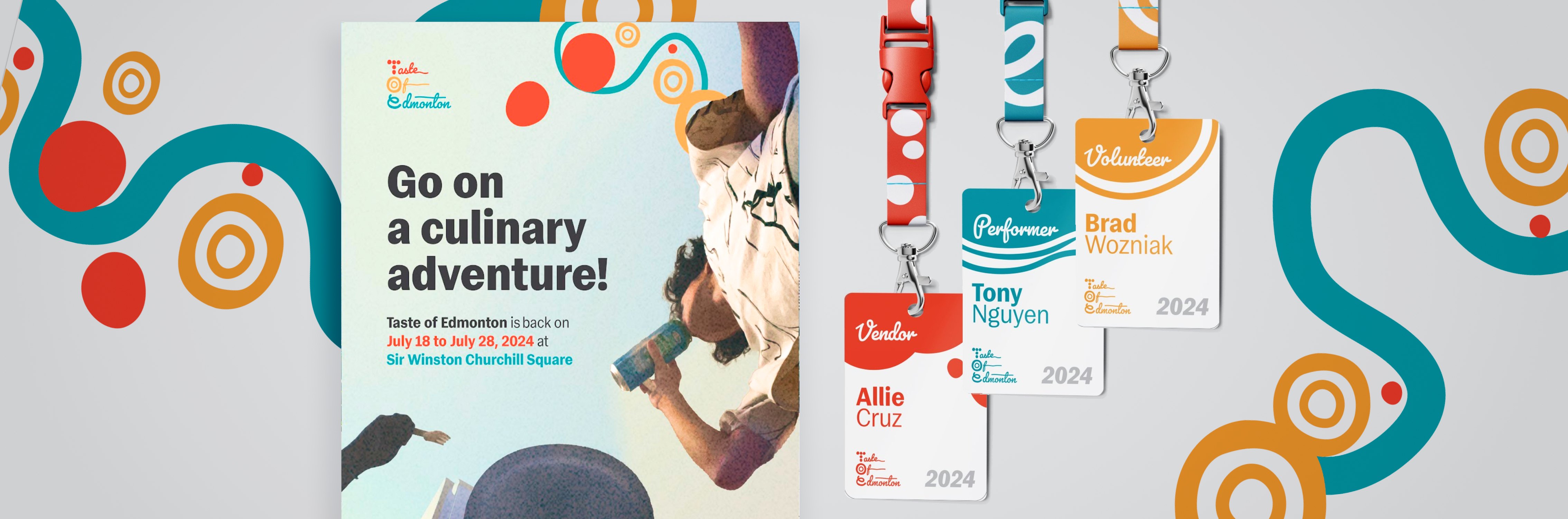
The identity was applied across distinct formats — poster, event badges, and tickets— to validate that the shape language, color coding, and typography hold up in real-world contexts at every scale.
Event Poster
Large-format event poster using the full script logo, brand shapes as decorative elements, and the photo treatment system. Retractable banner format for on-site placement.
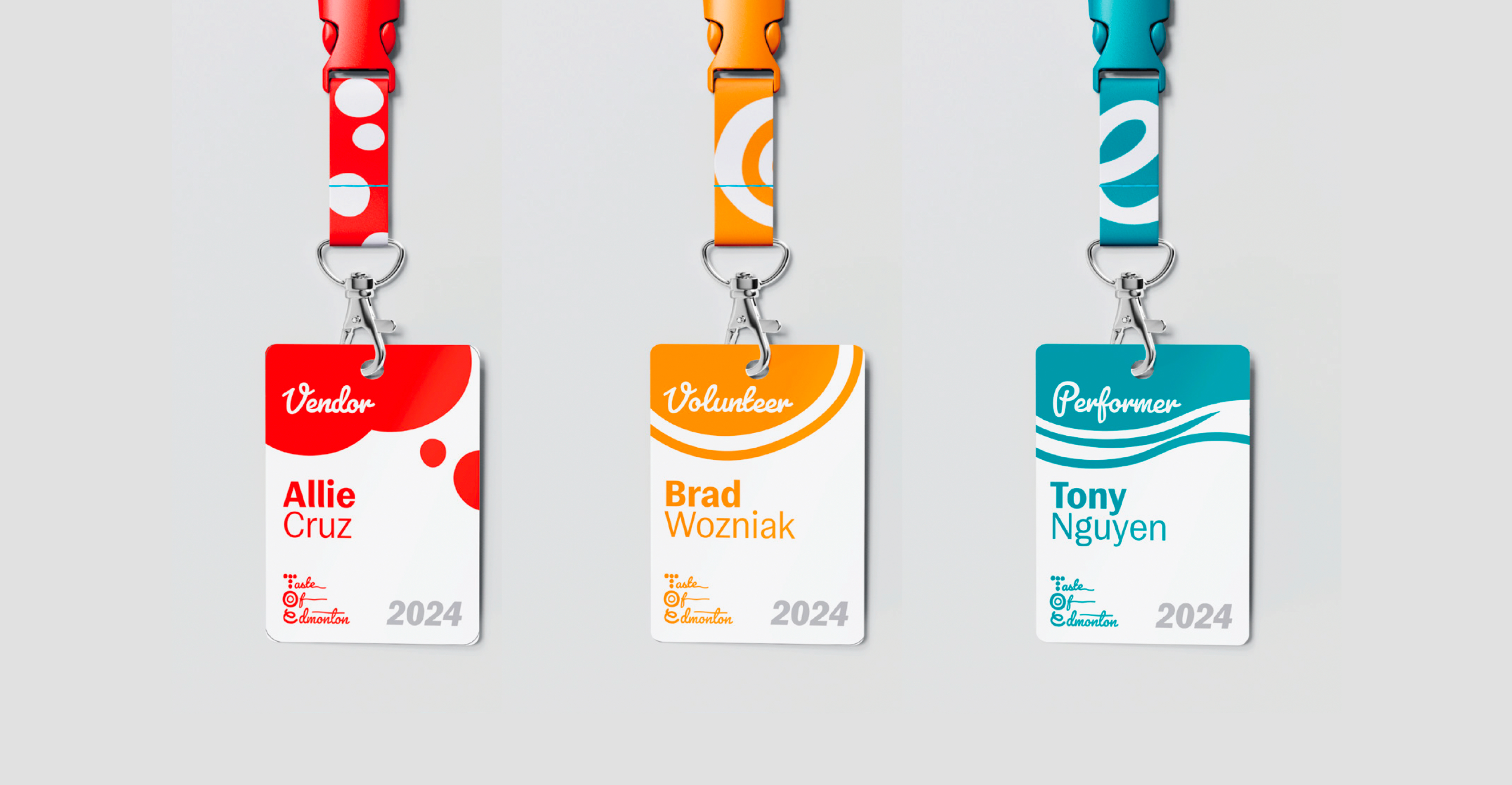
Event Badges and Lanyards
Minimum sizing and clear-space rules ensuring legibility at all scales.
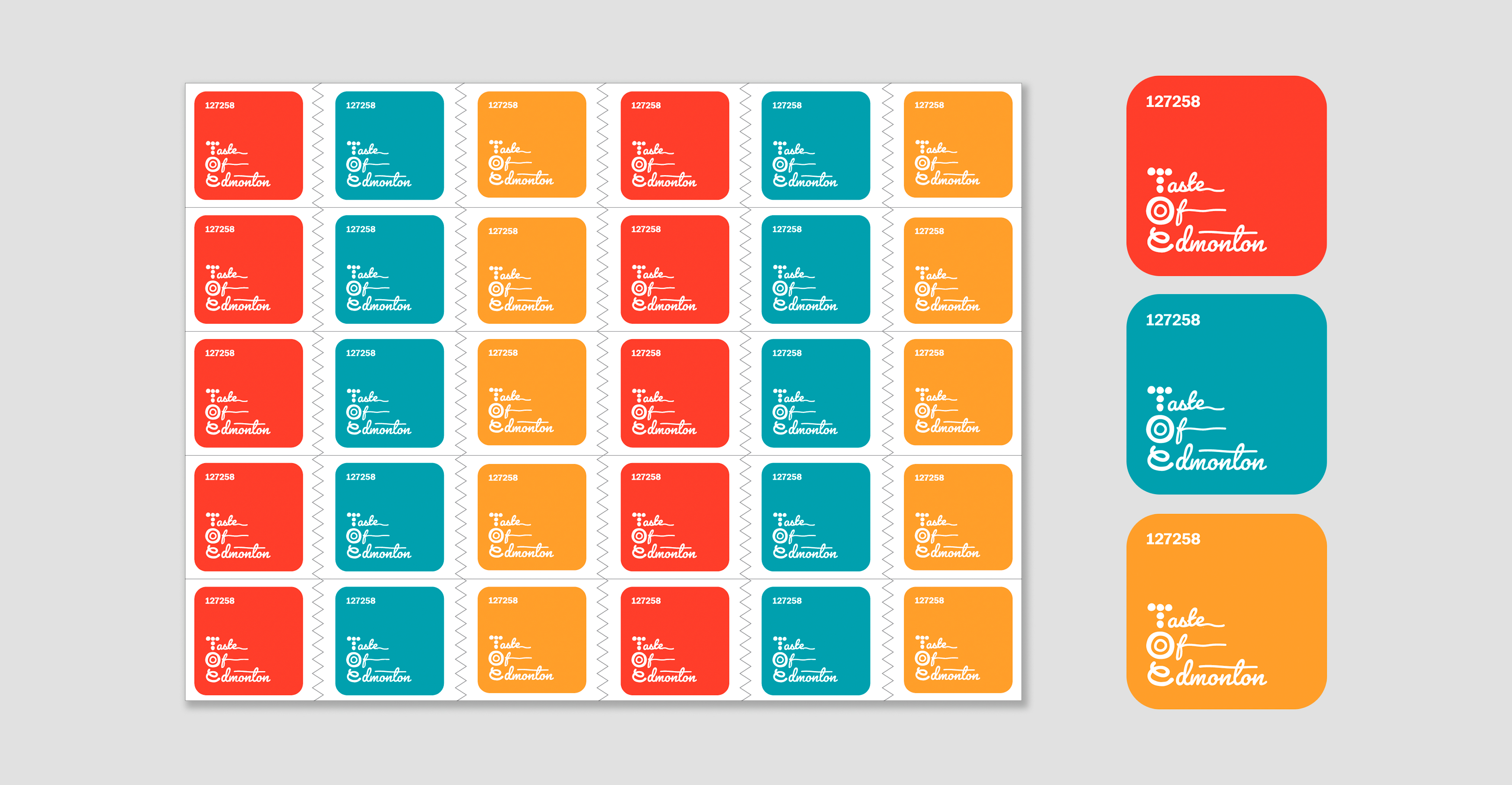
Tickets
Tear-off ticket sheets in assorted brand colors — red, orange, and teal — with logo, year, and unique ticket numbers for inventory management.
The Result

Brand shapes functioned independently as pattern and texture across all collateral, proving the system extends beyond the logo.
Visual direction successfully differentiated from Heritage Festival despite operating in a similar warm-palette, community-event space.
Full brand guidelines document delivered as a 24-page reference covering logo usage, sizing, spacing, color, typography, and collateral templates.