.jpg)
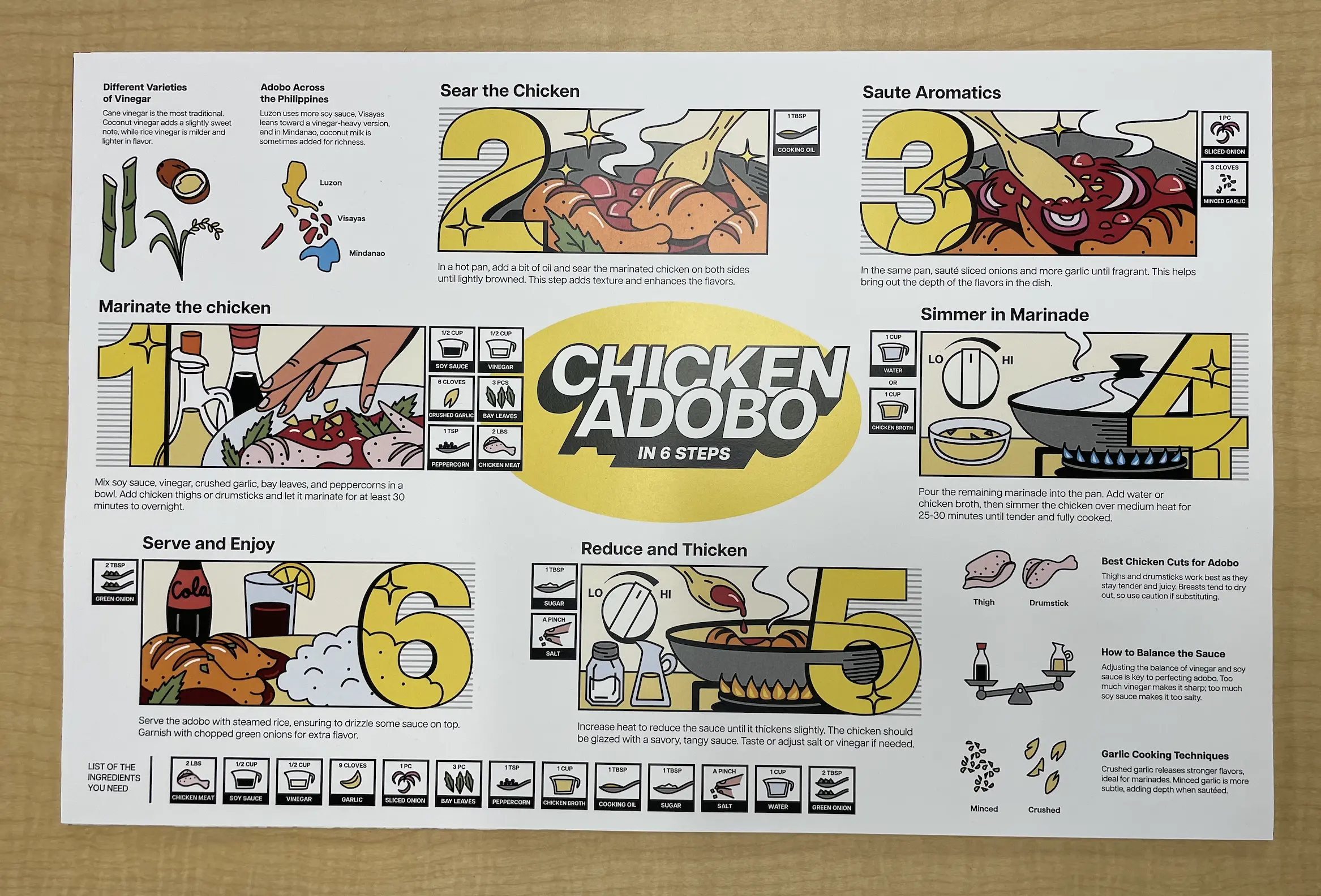
Chicken Adobo in 6 Steps
A single-page infographic that turns a culturally rich, multi-step recipe into a fast, readable system: clear sequence, visual cues, and “why it works” callouts for first-timers.

Graphic Design

Information Design Poster, Illustration
The Context
Filipino Chicken Adobo is simple to cook but easy to mess up without context (ratio, heat, order of operations). Most recipe posts bury key decisions in paragraphs.
I designed a poster that teaches the flow at a glance, while still preserving the cultural + technique details that make it “real” adobo.
I designed a poster that teaches the flow at a glance, while still preserving the cultural + technique details that make it “real” adobo.
The Constraints

One page, quick comprehension: The viewer should understand the full process in under a minute.
Must teach + guide: Not just pretty food art, has to function as instructions.
High information density without clutter: Steps, measurements, and extra context all need to fit.
The Approach
Instruction-first layout + systemized visual language
I treated the recipe like UI: progression, hierarchy, and reusable components (step panels, ingredient tokens, micro callouts) so the poster reads like a guided flow, not a wall of text.

The Exploration
I iterated on layout directions to balance readability vs. density, testing panel structure, step ordering, how aggressive the numbering should be, and where “extra info” lives so it supports the main flow instead of competing with it.


The Final Result
A bold, comic-panel style infographic with 6 clear steps (marinate → sear → sauté aromatics → simmer → reduce/thicken → serve) supported by icon-based measurements and “helpful sidebars” that answer common failure points.
Final Poster
Hierarchy Map
.jpg)
Main Layout Changes
.jpg)
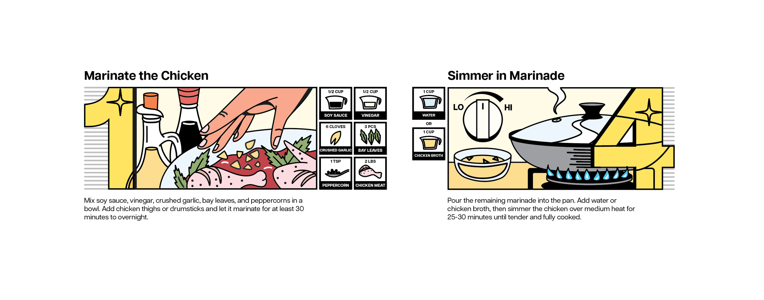
Layout Variants
Two layout variants of the step module, adjusting number scale and icon placement to keep illustration, ingredients, and instructions visually balanced across different poster positions.
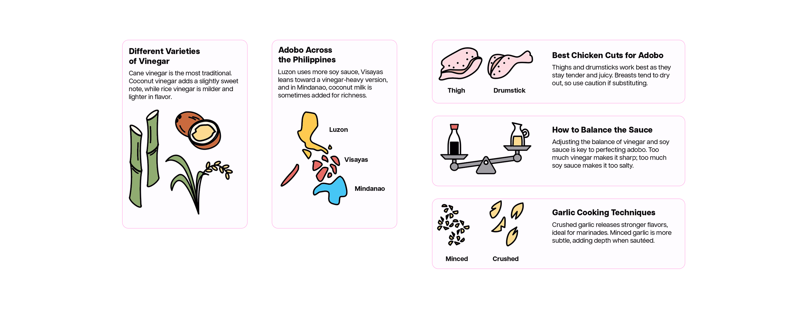
Supporting Info Modules
Supporting info card system, built as reusable modules with consistent hierarchy (icon first, headline, 1–2 lines) to keep dense tips readable without competing with the main recipe steps.
Icon set + measurement system
.jpg)
The Application